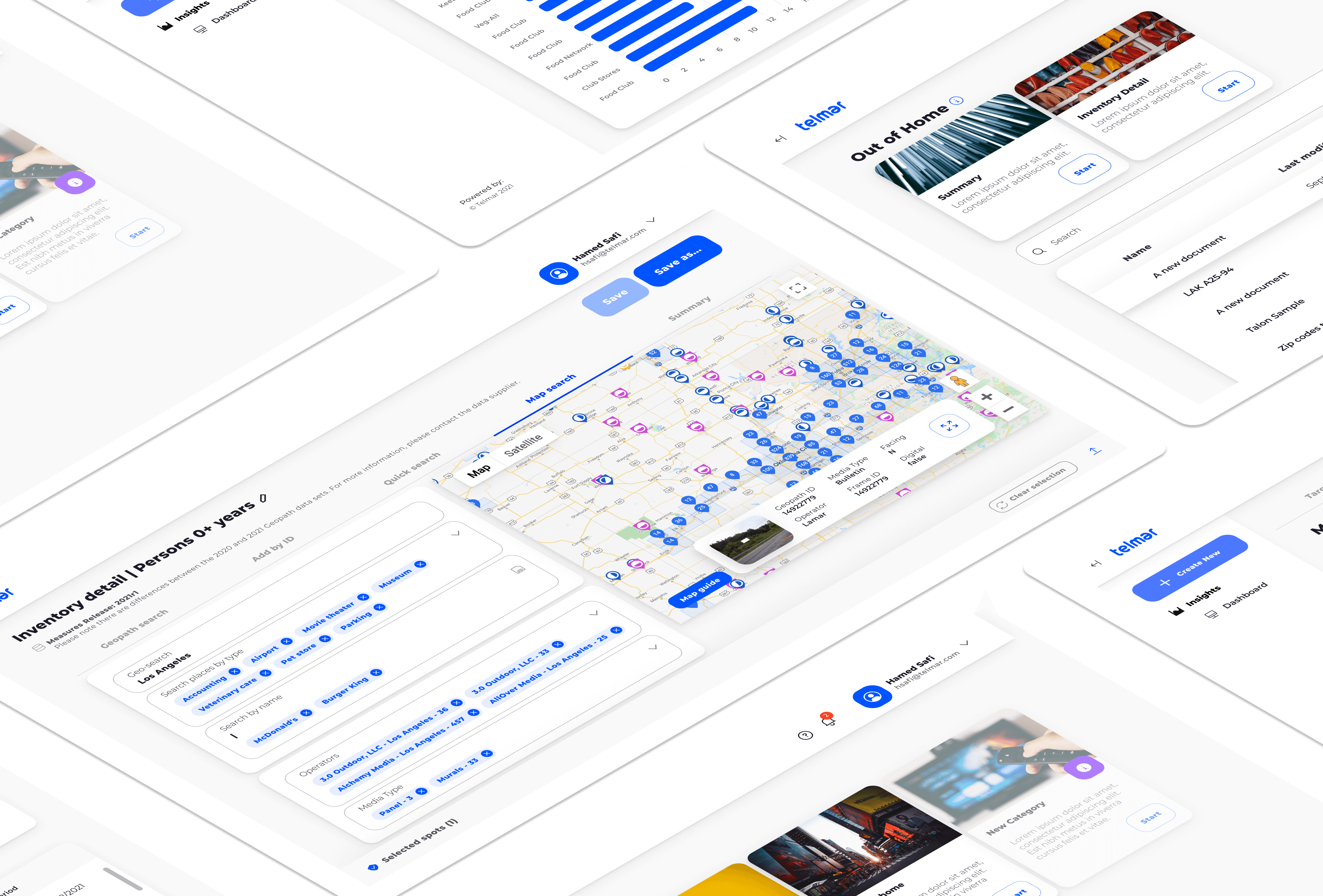
As the Senior UI Designer on the Telmar platform, I was responsible for shaping unique, user-centric products and experiences. With over 20 products on the platform, my role involved managing and designing every page and step of the user journey to ensure alignment with the UX design team's overall vision.
To achieve this, I worked closely with the relevant product owners to coordinate resources and enable efficient sprint planning and product roadmap delivery. I also collaborated with the UX team to prototype ideas, gather feedback through user interviews and surveys, and iterate on design concepts based on data insights and feedback. This involved producing a wide range of design materials, from sketches and prototypes to production-ready designs.
CHALLENGES
Consolidating all of Telmar's different modules and styles was a significant challenge. Each module had its own branding and visual style, and it was crucial to creating a cohesive look and feel that would tie everything together.
To overcome these challenges, I started with a thorough audit of all the modules and their styles. I looked at each module individually to identify the commonalities and differences in their design language. From there, I created a comprehensive style guide that would serve as the foundation of the new design system.
I collaborated closely with the development team to ensure the new design system could integrate seamlessly into their workflow. I created detailed documentation and provided support to help them adopt the new approach.
INSIGHTS
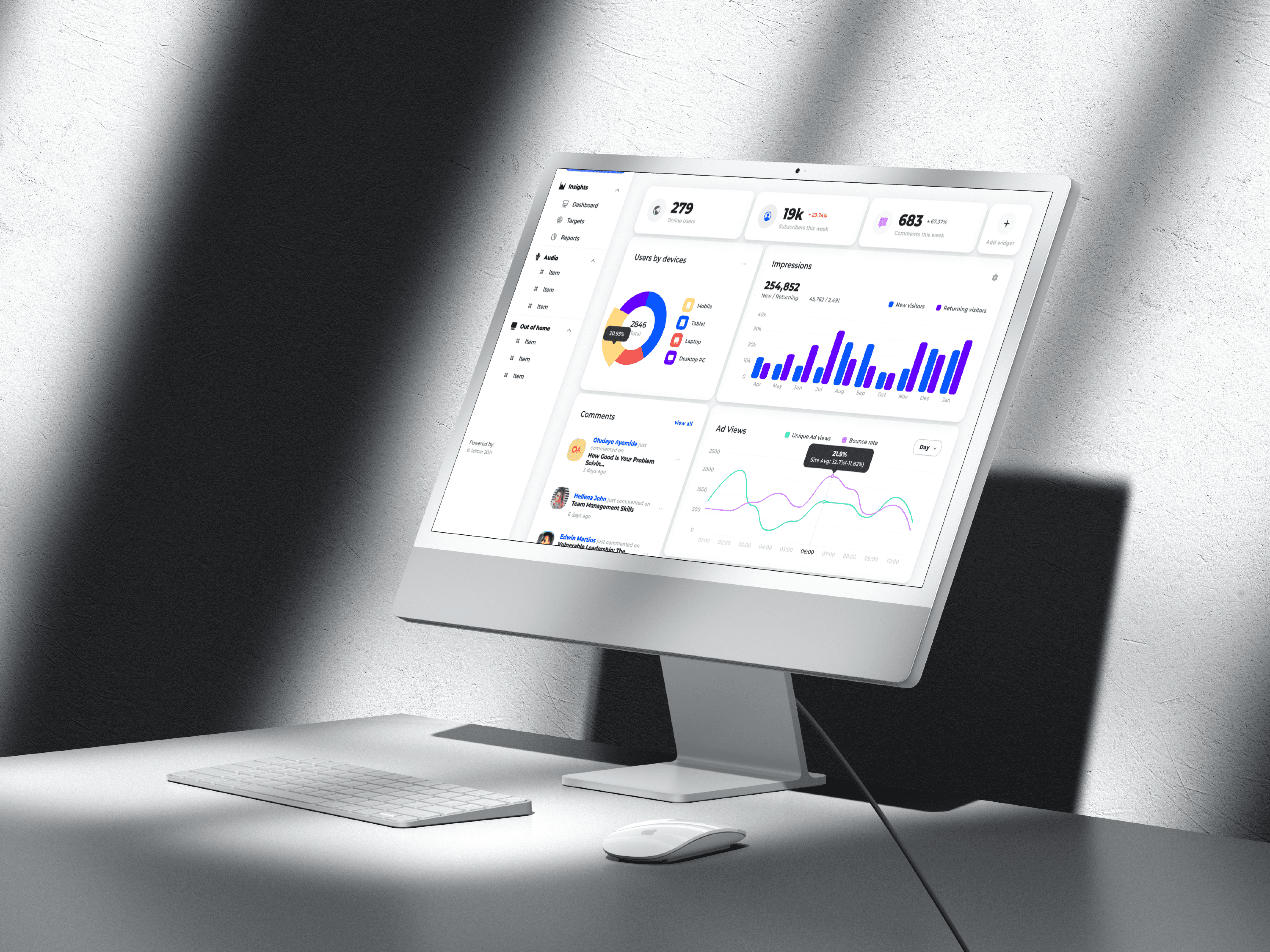
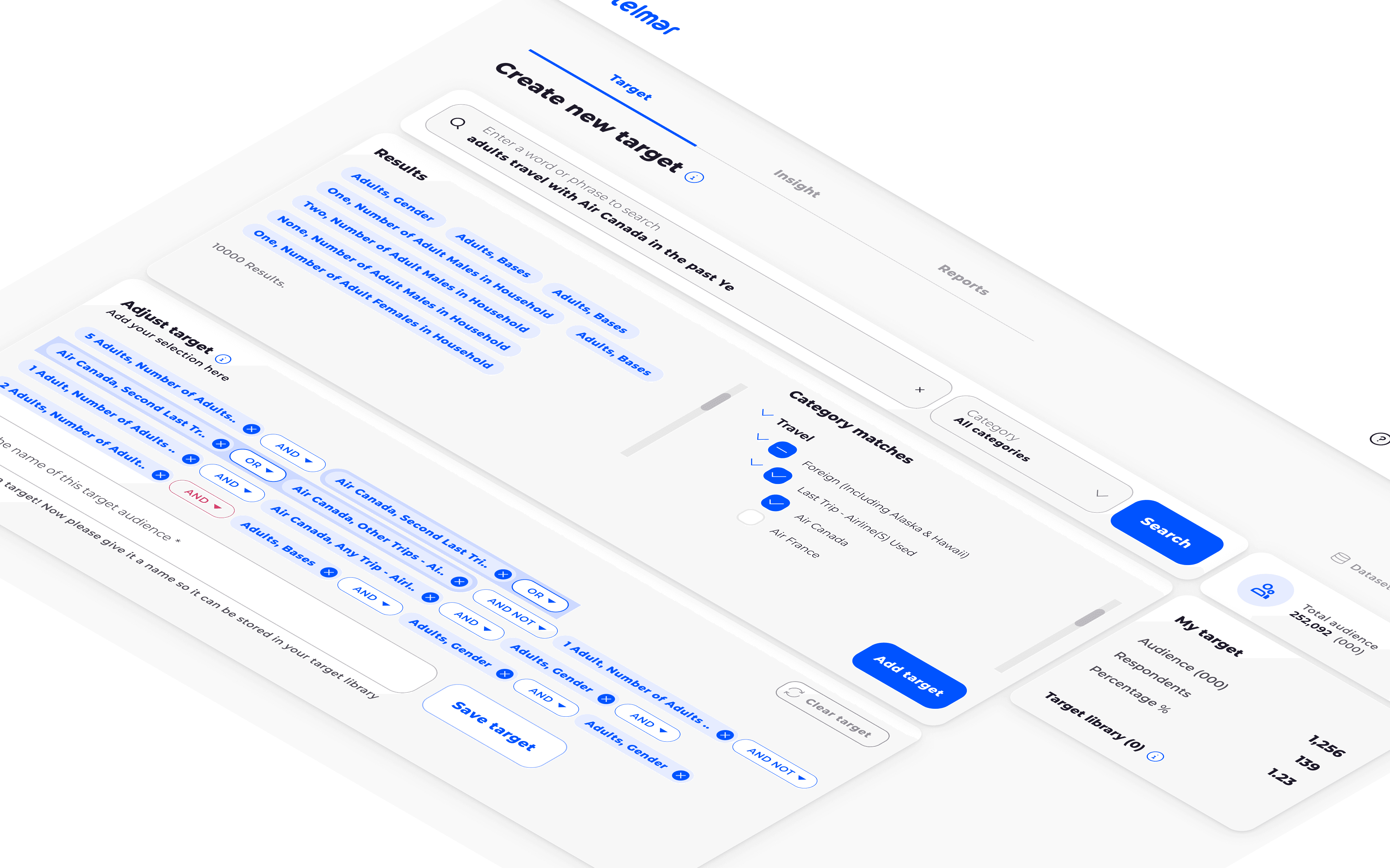
I faced many challenges when integrating various modules into the unified design system. One such module was the "Insights" module, which allowed users to uncover insights from multiple data sources with simple drag-and-drop functionality. However, the original module was quickly assembled by developers and desperately needed a facelift.
One of the biggest challenges was dealing with the data structure and organization. For example, search results were populating repeated suggestions or long-form text as UI chips, making it difficult for users to find what they were looking for. To address these issues, I worked closely with the system architects to revisit the data model and modify the data to improve the user search experience.
In addition to these data-related challenges, I introduced fixed UI components to reduce excessive scrolling for users. I also prioritized content in boxes and introduced steps and steppers to make it easier for users to understand the platform's functions.
Through iterative design and user testing, we created a more intuitive, user-friendly interface for the "Insights" module, aligned with the overall design system. Ultimately, this made it easier for users to uncover insights from their data sources and make more informed decisions.
OUT OF HOME - OOH
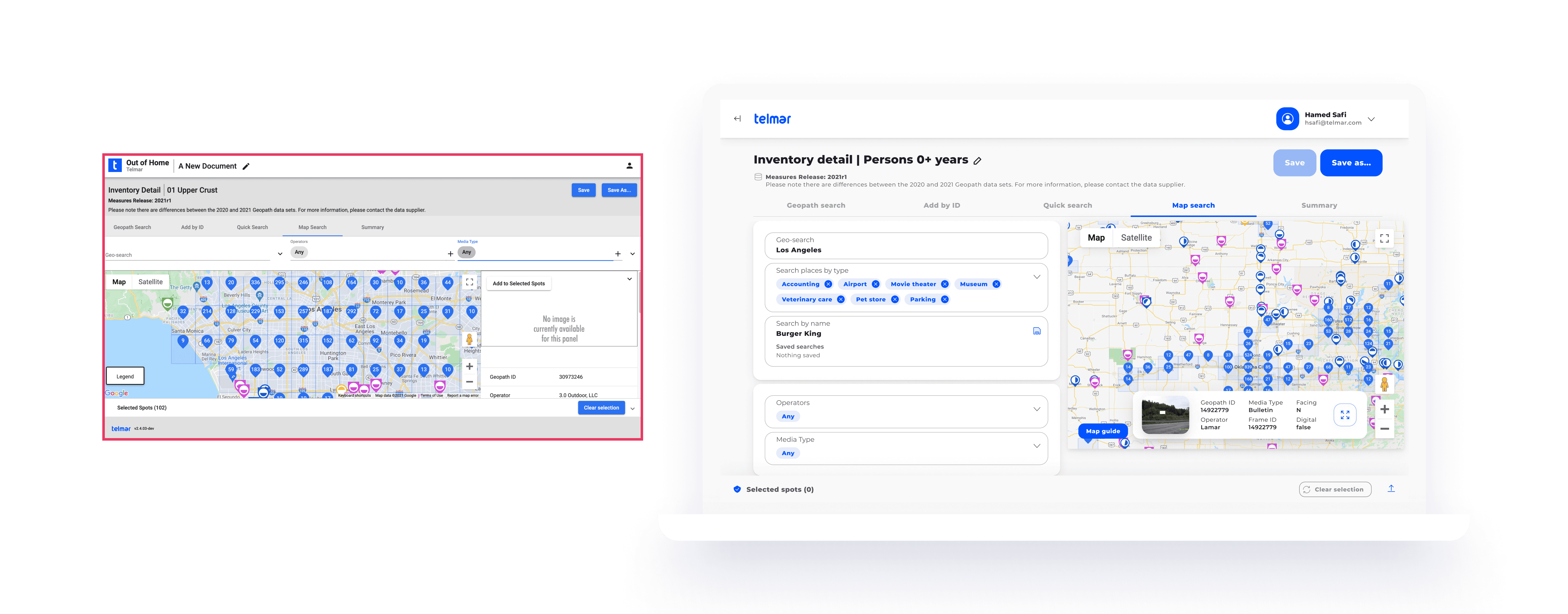
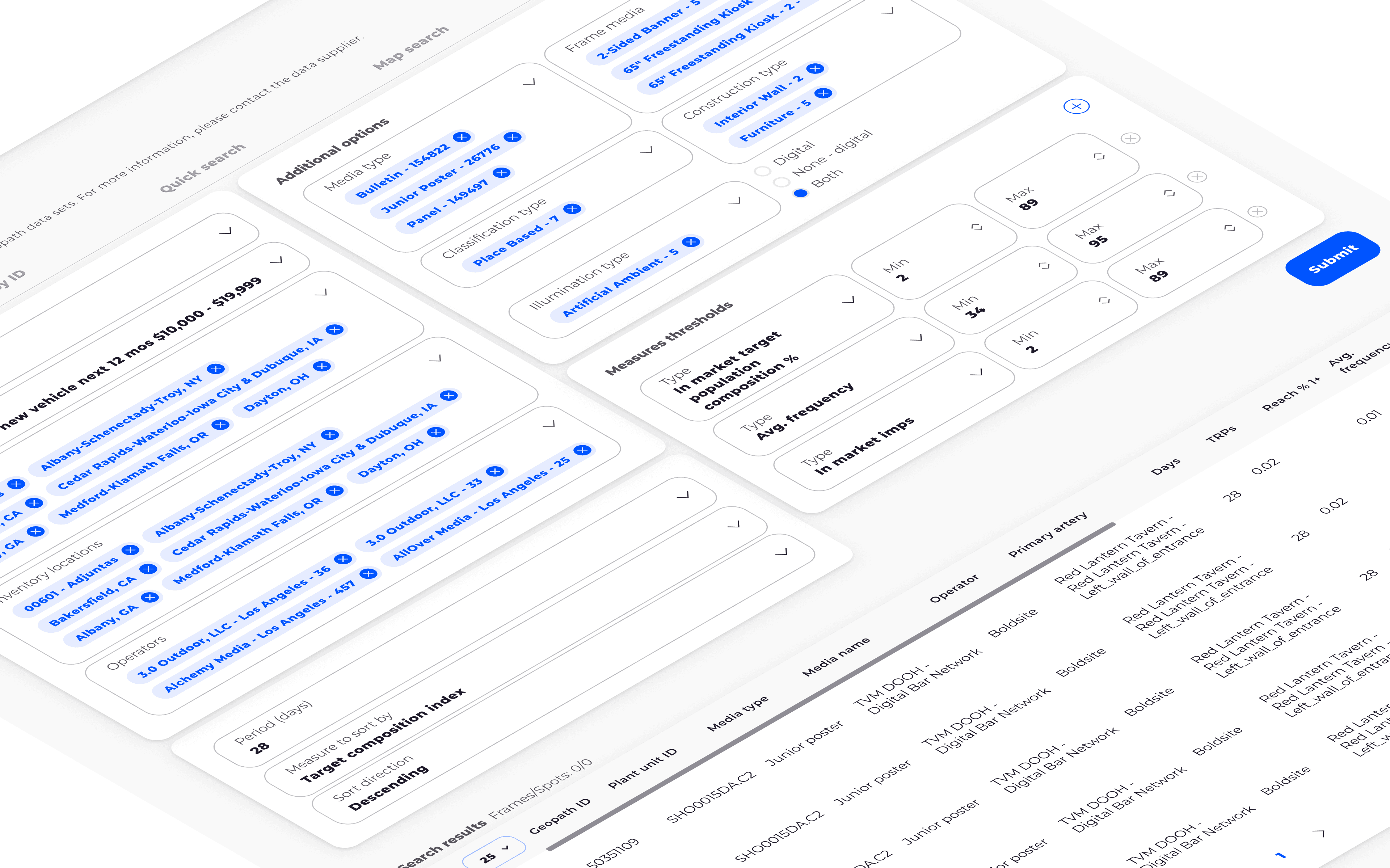
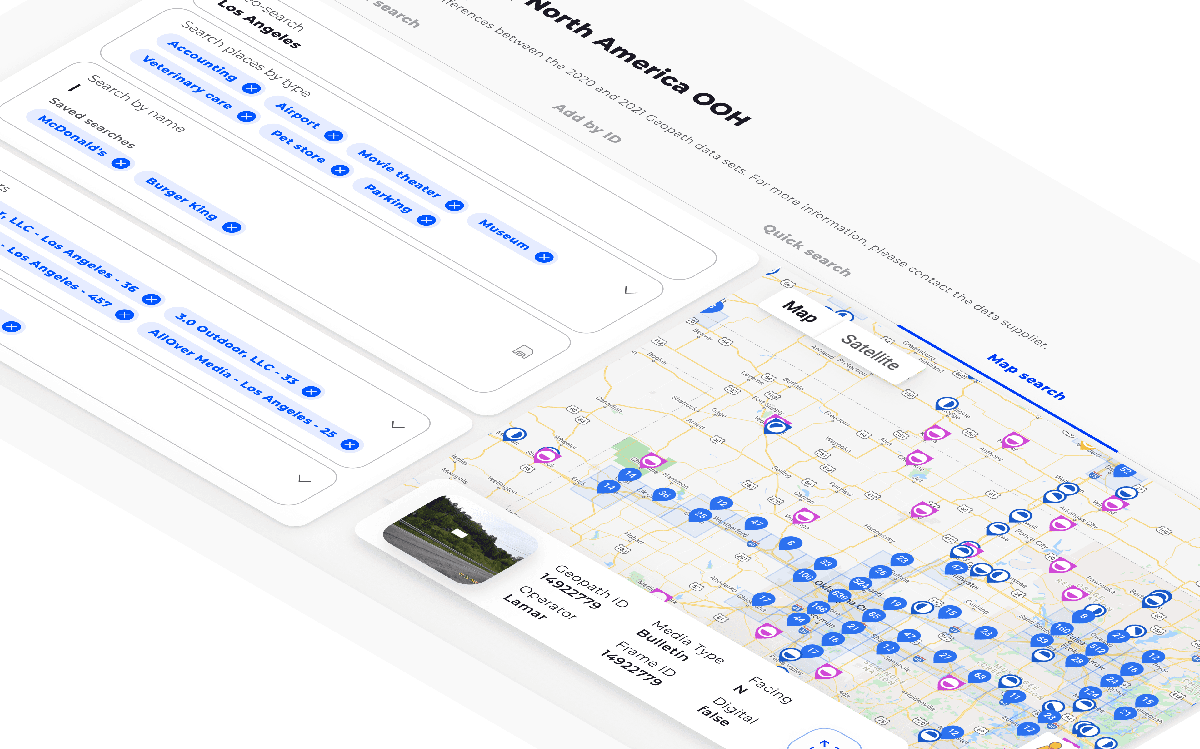
The OOH module was a crucial component of Telmar's media planning platform, allowing users to search for and select digital out-of-home advertising inventory on an interactive map, with preselected conditions and audiences. However, the existing module faced numerous challenges that made it difficult for users to navigate and plan their advertising campaigns effectively.
One of the primary challenges was the map's screen size, which made it difficult for users to view all relevant information at once. Additionally, the map was not fixed to the screen, so users had to scroll back and forth between the map and the search panel to make changes.
The fields for audience selection and conditioning were disorganized and lacked a clear hierarchy, making it challenging for users to navigate the options. Finally, the map was difficult to navigate, and information for each digital OOH billboard was often hidden, making it hard for users to find what they needed.
I was tasked with addressing these challenges and designing a more user-friendly and efficient OOH module. My first step was to conduct extensive user research to understand better the pain points and challenges users faced when using the module.
Using this research, I developed a design strategy to address the module's primary challenges. I began by designing a fixed map on the right side of the screen that allowed users to browse at any time, while modifying searches in the left-hand panel. This design ensured that users could view all the relevant information without scrolling back and forth.
I introduced a clear hierarchy and order to address the disorganization of the fields for audience selection and conditioning. This made it much easier for users to navigate the options and select the right campaign conditions.
Finally, to address the challenge of hidden information, I designed a modal that users could quickly open to learn more about a specific billboard. This design element was vital for large brands and significant data users, making campaign creation and forecasting easier and more efficient.
The new design system for the OOH module was a significant success. It received overwhelmingly positive feedback from users, who appreciated its more user-friendly, efficient interface. Overall, the OOH module redesign was a crucial project demonstrating the importance of user-centered design in creating more effective and efficient tools for media planning.
AUDIO
One of the modules required for integration into the unified design system was the "Audio" module. This module allowed users to research and gain audience insights on radio stations in North America. However, the module's original interface was less user-friendly and required significant improvements to meet users' needs better.
One of the primary challenges of this module was to create an interface that would allow users to navigate among different radio stations and easily view target audiences. Additionally, users needed to be able to build audience groups and export data to generate reports and analytics.
I introduced a range of components and features to the module to improve usability. For example, I added filters to help users easily find radio stations based on criteria such as location, target audience, and format.
DESIGN SYSTEM
One of the key challenges I faced in this role was architecting the Telmar platform's design system using the Atomic Design methodology. This involved adopting existing design systems, identifying where custom components could elevate the user experience, and then building on that innovation. I was tasked with introducing a new design system to unify the experience across their media planning platform.
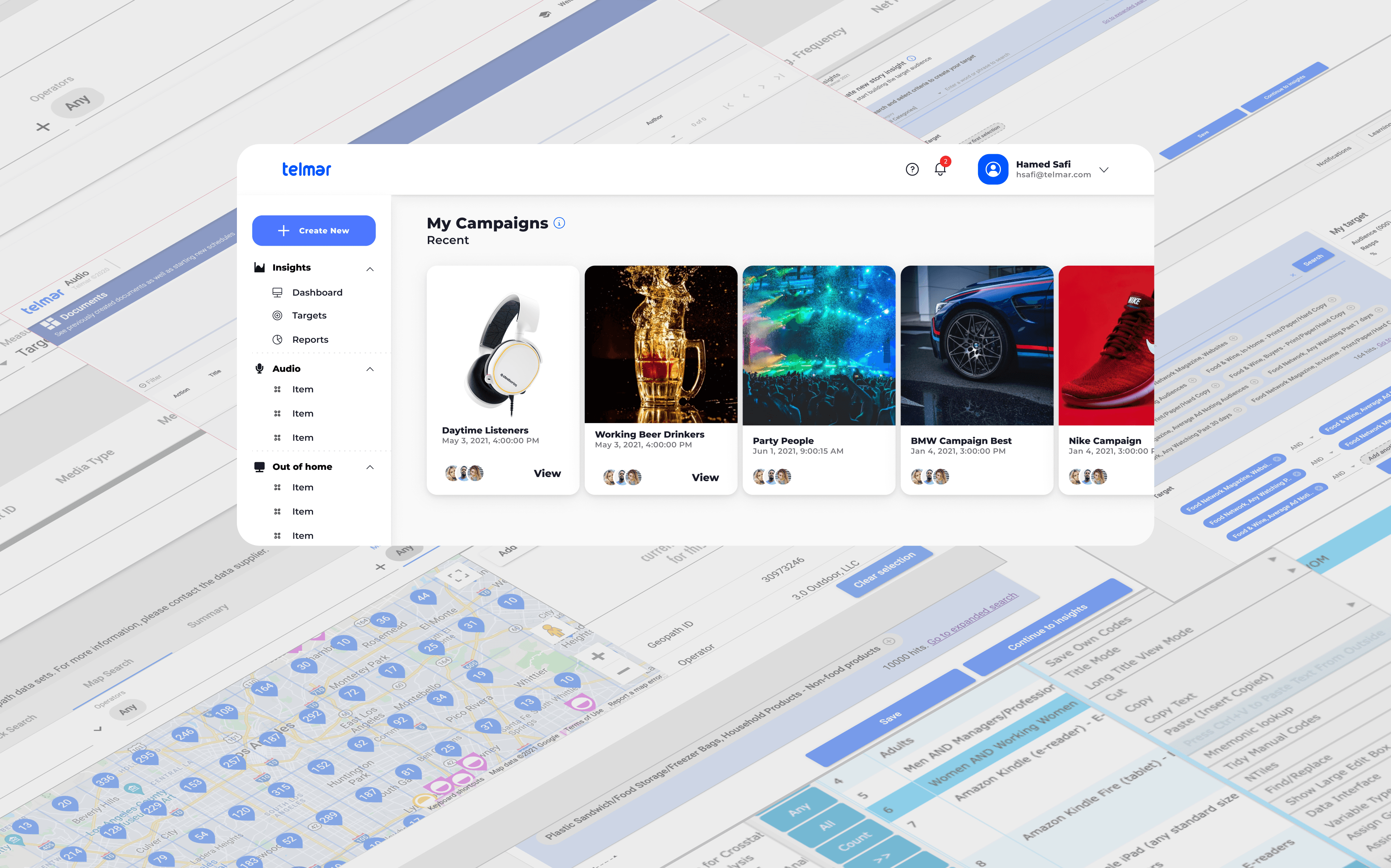
To tackle this challenge, I worked closely with the development team to understand their requirements and the users' needs. Telmar initially used Material UI in their development environment, but we quickly realized that a custom design system was necessary to meet the platform's specific needs. Through user research and iterative design, we created a new design system that consolidated all scattered modules into a single platform and unified the experience. The new design system consisted of a consistent visual language, typography, color palette, and design components.
This new design system made the platform more visually cohesive and improved the overall user experience. Users can move seamlessly between products and modules with a more consistent interface, without feeling disoriented.

Buttons

Inputs

Chips

Alerts

Charts & Graphs

BEFORE & AFTER
During the redesign, I aimed to improve the user experience by introducing a unified design system consistent across all Telmar products and modules. The redesign included improvements to navigation, information organization, and the overall layout of each module. The before-and-after images demonstrate significant progress in each module's user interface, making it more intuitive, user-friendly, and aesthetically pleasing. With the new design system, users can quickly and easily navigate the various modules, making their media planning tasks more efficient and effective.